One of the biggest areas of advancement in Project Server 2010 is reporting, with Project now utilising; Excel Services, SQL Analysis Services, SQL Reporting Services and PerformancePoint the options are almost endless.
However most people I encounter look at that list and say; “What on earth is PerformancePoint?”, so lately I had another opportunity to flex my PPS skills and thought I might share my experience to give you a taste of how powerful yet simple to use this new thing can be.
Creating a Dynamic Resource Utilisation Graph using PerformancePoint
I’m going to keep this very simple, as I find PPS to be very often quite mind-boggling, so to give you a taste of it what I’ll describe here is how to create a simple equivalent to the old typical Data Analysis Resource Utilisation view.
So before you begin, make sure you have your Cube setup and built, the PerformancePoint service application setup and running in your SharePoint installation and some data to play with.
First step you need to get to the PerformancePoint Dashboard Designer, this is a nifty little web application (independent from the Office Web Apps) that is automatically installed and made available when you provision a PWA site.
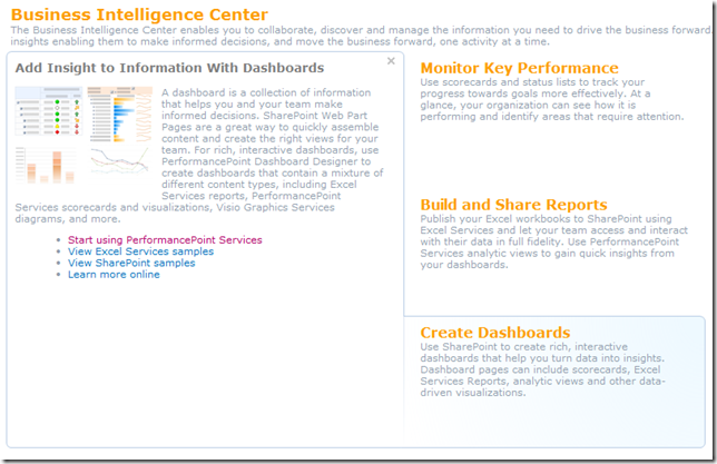
To find it, open up the Business Intelligence site, and from there the quickest way to get to it is by hovering over any of the landing page images (Create Dashboards, etc) and selecting the ‘Start using PerformancePoint Services’ link.
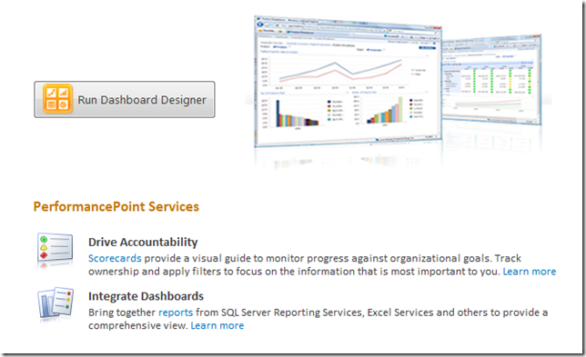
You then have the icon to run Dashboard Designer:
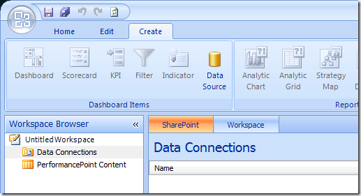
This should download and install the designer for you, and assuming that you have all the correct permissions (and that PWA is in your Internet Explorer trusted sites), you will end up with a mostly empty designer window looking something like the image below.
Now you’re ready to start creating those reports, first step setup your Data Connections by selecting the Create tab on the ribbon and selecting Data Source:
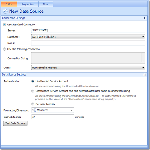
Select Analysis Services as the connection type, and populate the connection details and properties as required:
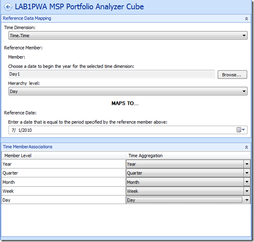
For Analysis Services datasources you should populate the Time tab to ensure that your Time dimensions are correct, something like this;
Finally when you are done, select save from above the ribbon to continue.
Note: This is something you will get used to with the Dashboard Designer, everything is automatically saved to the PWA BI site in their respective locations (dataconnections, reports or dashboards), with just one exception being the ‘Workspace’ which is effectively your configuration of Dashboard Designer (something I don’t usually bother saving).
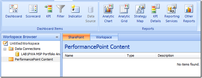
Now lets move on and create our report, select PerformancePoint Content and then from the Create ribbon lets select ‘Analytic Chart’;
Then select your datasource just created and hit finish, then your report will open in the designer;
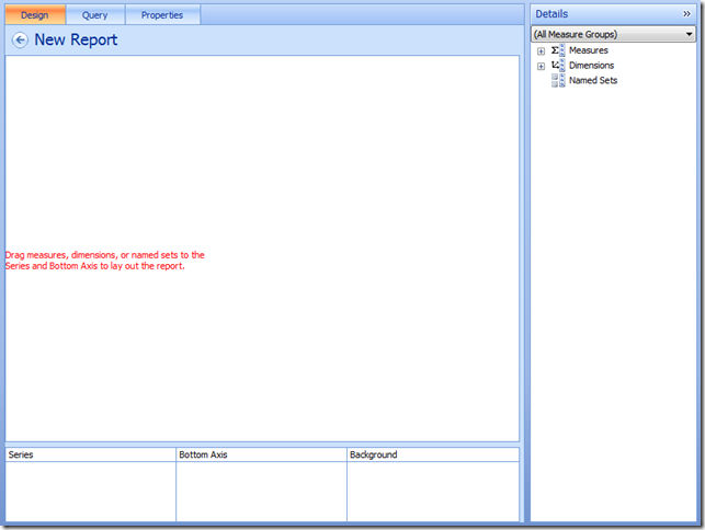
Give it a name and then lets start adding content:
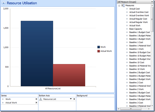
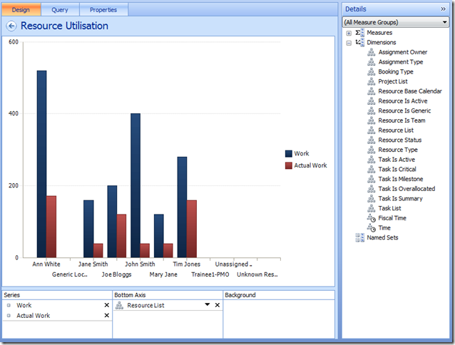
- First add some measures to the Series; Work and Actual Work.
- Now add your Resource List dimension to the Bottom Axis.
It should look something like this;
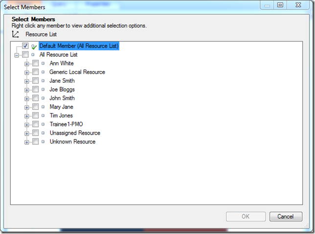
If you want to expand members of a dimension select the chevron (Down arrow next to the X), and select the members in the dialog.
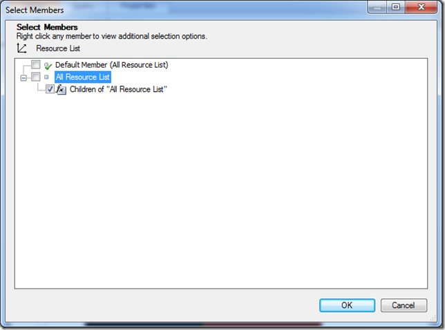
Here for dynamic dimensions like the Resource list you are better off right-clicking and selecting one of the Autoselect Members, such as All Children, like so;
Which now looks like:
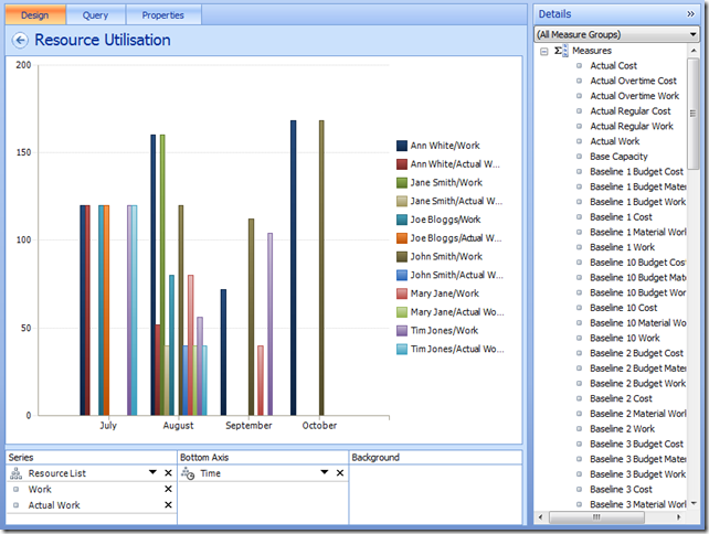
Finally we need our Time dimension, add it to the Bottom Axis from the right list and use the chevron to select the desired time periods (I’m selecting months by name here, however you can use something called Named Set’s to do this dynamically for you – another blog article maybe). Finally I think it’s best to move the Resource List to the top of the series Series list and apply some filters to filter out the blanks, to give us something like:
Don’t forget the Edit tab on the Ribbon which has a number of settings that you’ll find handy getting your report right.
Almost there now..
Okay so now we’re ready to save and see this thing for real, so hit the save button, and lets minimise the designer and go back to our BI site in Internet Explorer.
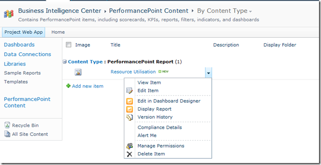
If you open the default ‘PerformancePoint Content’ link, you should see your new report listed, select the drop-down to Display the report:
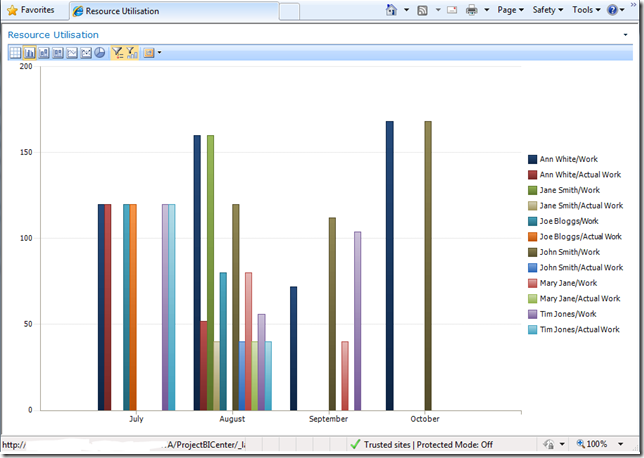
Final product:
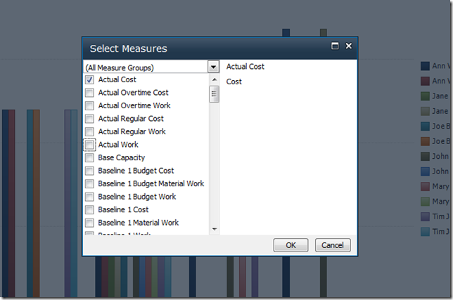
Now this report is ready to add to any where in SharePoint using the PerformancePoint viewer web part, and the best thing is that all of the dynamic functions will be available to all users, so if someone wants to view this report in terms of Cost / Actual Cost, it’s just a few clicks away:
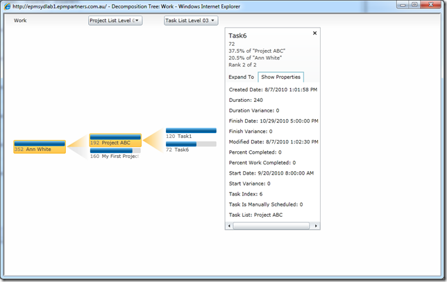
Or maybe you want to see the breakdown of a particular person’s activities using the Decomposition Tree?
I’d say this beats those old Data Analysis views!
That’s it for this how-to, hopefully this scratching of the surface has shown you some of the potential of PPS, keep experimenting and you’ll see very quickly how easy it is to replace those old Data Analysis views that are so 1990!
In the future I might come back and write a Part II to this one on creating your first KPI Scorecard in PPS, stay tuned..

This is awesome,
Thanks for sharing this. You made it look very simple with screen shots.
Keep up the good work :)
Cheers!
Thanks , Great article, it took some time to start the services , create secure store application etc , but after all that it was worth it :) , Thanks for sharing.
Thanks , Great article, it took some time to start the services , create secure store application etc , but after all that it was worth it :) , Thanks for sharing.
THNX A LOT
Dude this is great post . waiting for the next one .