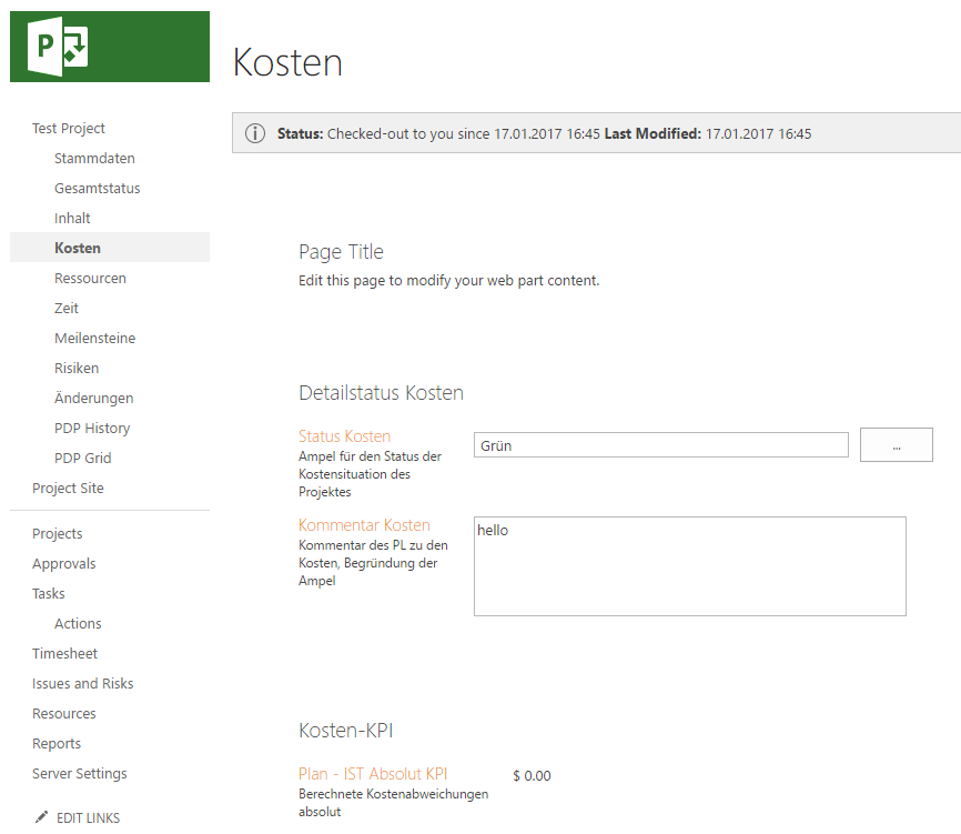
One of those small annoyances that I find myself always fixing (or being asked to fix) is the default page layout of a Project Detail Page in PWA, for example:

Specifically around and between each web part on the page there is a large margin that even (partially) exists when you insert hidden webparts. Additionally the content alignment is out compared to other pages; ie the page title “Kosten” in this case is not left aligned with the page content and sub headings.
Easily fixed with a little CSS
This can be easily fixed with (you guessed) a content editor webpart and the following html style sheet:
<style type="text/css">
.ms-webpartPage-root {
    border-spacing: 0px;
}
</style>
The value was previously “20px”, so if 0px padding is too little then you can try a different value. Additionally there are lots of other styles that you might like to play with, for example: “.ms-PartSpacingVertical” is by default empty but is useful if you need a very specific gap between web parts.
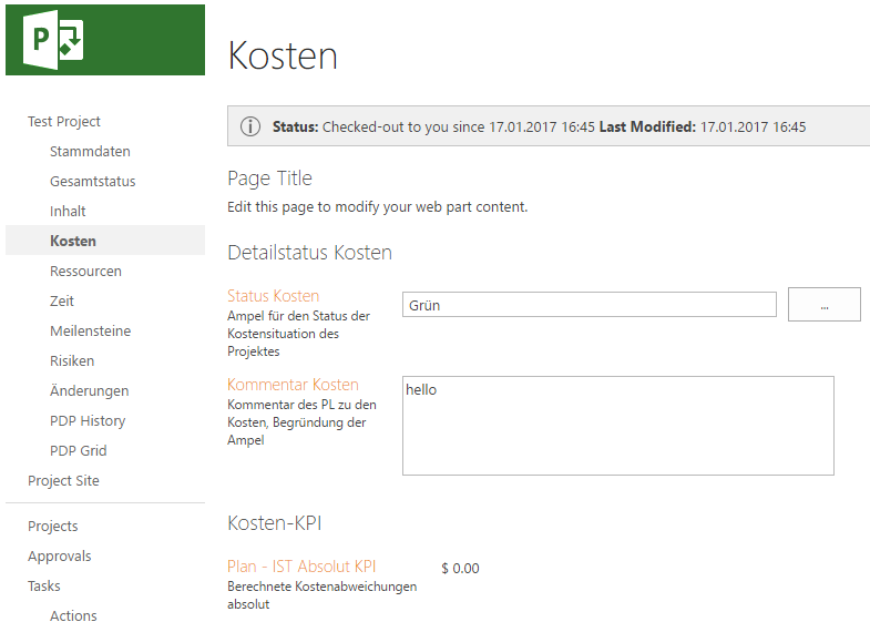
When inserted in a hidden content editor web part anywhere in the page results in:

Now that page title is a little too close, but now that can be easily edited as needed.
Futhermore, while I’ve not included it in this example, if you want to remove absolutely all spacing then add the following CSS:
.ms-webpartzone-cell {
    margin: auto auto 0px;
}
That 0px value changed from the default of 20px removes all spacing including the margin that hidden web parts have so if like me you find yourself with lots of hidden content editor webparts with scripts and such, then this can be useful.
Hope someone else finds that useful.
